Pulse Methane Tracking World Map
"We've got a situation where for more than the last decade there's been a significant and unexplained upward tick in global methane atmospheric concentration."Jonathan Elkind, senior research scholar, Columbia University Center on Global Energy Policy"[It will] stimulate discussion and inspire people to ask questions.""The concentrations shown are in the atmosphere -- not just at ground level. The concentrations in one region therefore may be due to emissions in another region.""The global warming potential of methane is 84 times greater than that of carbon dioxide -- the greenhouse gas we may be most familiar with.""It is important to know where, when and how methane enters the atmosphere. Reducing methane emissions is an important tool in the fight against climate change."Stephane Germain, company president, founder, GHGSat Inc., Montreal
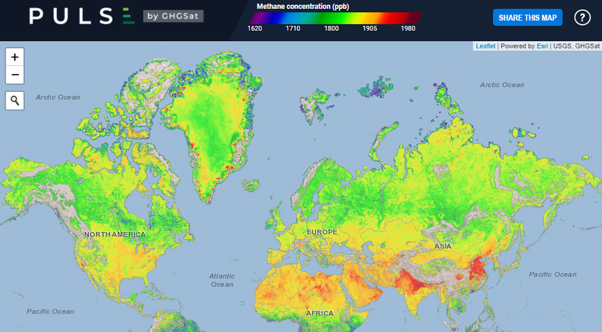 |
| GHGSat unveiled Pulse, a free map showing average weekly methane concentrations around the world at a resolution of approximately two kilometers per pixel. Credit: GHGSat |
"We know that there is not a lot of industrial activity in Northern Canada.""The red areas [on the map] are natural sources of methane. One of the important consequences of climate change is the impact on permafrost melting, which can influence methane emissions.""But when you go into summer -- June, July, August -- the colours start to change to red.""It is reasonable to assume that there is more methane due to the melting permafrost."Sarah Gallagher, scientific adviser, Canadian Space Agency
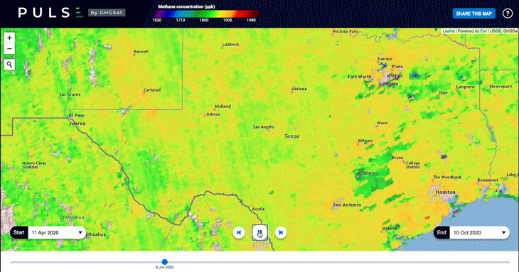 |
Timelapse of methane concentrations in Permian shale of West Texas and New Mexico from June through October. Source: GHGSat Inc. |
The most accurate map of global methane concentration ever devised has just been released by a Montreal company, the methane map called Pulse, using data from the company's two satellites, launched earlier in the year and is capable of detecting methane emitted by oil and gas wells, coal mines, power plants, farms and factories. This significantly updates climate surveillance, becoming a vital tool to hold countries and companies accountable for meeting targets in the reduction and eventually elimination of planet-warming pollution.
Access to the interactive map is free online, with a resolution of approximately two kilometres by two kilometres. A version of the map with a finer resolution of 25 metres by 25 metres is available through subscription. Accounting for a quarter of all man-made greenhouse gas emissions, the capability of tracking methane is vital. Methane emissions have risen by close to ten percent over the past twenty years, according to the science journal Nature.
A six-month period through to October 10 is represented by the time-lapse map GHGSat published recently, based on images captured weekly from space, along with information gleaned from partners such as the European Space Agency. Green represents average methane emissions, at roughly 2,800 parts per billion, while yellow is above average, and dark red represents the high end of the methane emissions scale.
The lockdowns meant to slow down the infection pace of the COVID-19 pandemic devastated normal demand for oil, sending methane emissions lower and these readings represent the early count. Methane's swift buildup during the hot summer months in the Northern Hemisphere, show orange and red pixels along the Arctic coast and around Beijing, through intensification on the map which identifies concentration of methane across the troposphere where naturally occurring emissions mingle with those caused by human activity.
Wetlands are one example of naturally occurring emissions, while mountains are seen to trap methane, as in Southern California at the Sierra Nevada range, or in South Asia below the Himalaya. More than 80 times greater potency that carbon dioxide over a twenty year period, methane's greenhouse impact fades faster than that of carbon dioxide. In a paper published recently, Professor Elkind of Columbia University outlined the manner in which satellite-driven transparency will permit investors to better identify which companies fail to back up their goals with action.
The map, according to scientific adviser Sarah Gallagher, revealed fluctuations in methane concentration in Canada's Far North as in April and May when the northern region remains largely covered with ice and snow, showing up on the map in green and blue colours that correspond to low methane concentrations. Roughly 40 percent of the world's annual methane emissions come from natural sources, with the rest attributed to human activity.
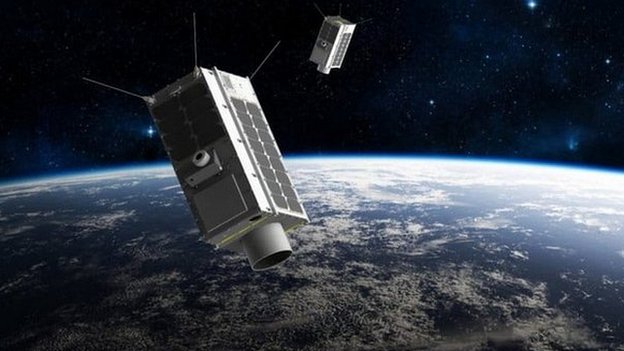 |
| Artwork: GHGSat is aiming for a constellation of greenhouse-gas monitors in the sky GHGSat |
Labels: Climate Change, GHGSat Inc., Global Methane Production, Satellite Imagery
posted by Pieface @ Sunday, October 25, 2020
![]()
![]()

<< Home